Integense Microelectronics
Brand Guidelines
The following guidelines define Integense Micro’s brand identity, visual style, and messaging to ensure consistency across all platforms and communications. These standards help maintain a cohesive brand image in the semiconductor industry and should be followed by everyone representing the Integense Microelectronics brand.
Brand Tagline
"Smart Silicon, Seamless Integration."
Why This Tagline Works…
Highlights Intelligence and Innovation
The phrase “Smart Silicon” emphasizes intelligent semiconductor technology. It conveys that Integense Micro’s ASIC solutions are advanced and innovative, aligning with the company’s expertise in semiconductor innovation and intelligent chip design.
Emphasizes Integration Excellence
“Seamless Integration” underscores the company’s strength in system integration. It suggests that Integense Micro’s solutions fit together smoothly within larger systems, reflecting the promise of hassle-free, end-to-end integration for customers.
Concise and Impactful
At just four words, this tagline is simple yet powerful. Like Marvell’s “Essential technology, done right,” it pairs two key concepts with a clear, confident tone. This brevity and balance make it memorable and professional, on par with industry leaders.
Comprehensive Value Proposition
“Smart Silicon, Seamless Integration.” merges the ideas of intelligent technology (smart silicon) with flawless system synergy (seamless integration), delivering a message that the company provides cutting-edge ASIC solutions and smooth integration – all in one concise tagline.
Brand Identity
Mission and Vision
Mission
Deliver innovative, high-performance semiconductor solutions through an end-to-end development approach. Integense Micro’s mission is to revolutionize the semiconductor supply chain by providing custom ASIC solutions that combine innovation, precision, and cost-effectiveness to drive superior performance and reliability for our customers.
Vision
Become a leading force in the semiconductor industry known for cutting-edge technology and integrated solutions. Integense Micro envisions a future where its pioneering end-to-end approach sets new standards in quality and efficiency, enabling advanced electronics across industrial, medical, and communications sectors.
Core Values
Our core values reflect what Integense Micro stands for and guide our decisions and behavior:
Innovation
We constantly push technological boundaries, embracing creative engineering solutions to disrupt the status quo.
Precision
We pay meticulous attention to detail in design and manufacturing, ensuring accuracy and exacting standards in every product.
Reliability
We deliver on our promises with dependable products and services. Consistent performance and quality build trust with our customers.
Quality Excellence
We are committed to the highest quality in processes and outcomes, striving for unmatched performance and long-term durability in our semiconductor solutions.
Agility & Flexibility
We remain agile in a fast-paced industry, quickly adapting to new challenges and market needs. Our flexible, end-to-end capabilities (from design to production) enable custom solutions and fast execution.
Customer Focus
We succeed when our clients succeed. Understanding customer needs in industrial, medical, and communications markets drives us to create value through cost-effective, optimized solutions.
Brand Personality
Integense Micro’s brand personality is the human qualities and attributes that the brand embodies. We strive to present a consistent personality in all communications. In other words, Integense Micro’s identity is that of an innovative, precise, reliable, and cutting-edge partner in the semiconductor industry.
Innovative & Cutting-Edge
We are forward-thinking and cutting-edge, always at the forefront of semiconductor technology. Our brand feels modern, progressive, and tech-savvy.
Precise & Technical
We come across as precise and highly technical, reflecting our deep engineering expertise. The brand voice demonstrates accuracy and attention to detail, reinforcing that we are experts in our field.
Reliable & Trustworthy
We are reliable and steadfast. The tone is confident and steady, showing that customers and partners can depend on our solutions and our word.
Authoritative yet Accessible
While we position ourselves as an authority in semiconductors (knowledgeable and experienced), we communicate in an accessible and engaging way. The brand personality remains professional and authoritative without being overly formal or distant. We are friendly, helpful experts who make complex technology easy to understand.
Visual Guidelines
Logo Usage and Variations
The Integense Micro logo is the cornerstone of our visual identity. Consistent and correct usage of the logo is essential:
Primary Logo
The primary logo is a horizontal lockup of our icon and wordmark. This horizontal full-color logo should be used in most branding applications for maximum recognition.
Color Variations
Use the full-color logo on light backgrounds. A black version of the logo is available for use in black-and-white or grayscale materials (e.g., fax, monochrome prints). A white (reversed) version of the logo should be used when placing the logo over dark backgrounds or imagery, ensuring sufficient contrast for legibility.
Icon-Only
The logo icon (symbol) may be used by itself in situations where the full logo might not fit or for social media avatars, favicons, and watermarks. Use the icon alone only when the context or accompanying text makes the brand clear.
Clear Space
Always maintain adequate clear space around the logo. Ensure a minimum margin around all sides of the logo equal to at least the height of the “Integense” wordmark (or a defined x-height) so that no text or graphics infringe on the logo. This preserves the logo’s visibility and impact.
Minimum Size
Do not scale the logo down so small that it becomes illegible. For print, ensure the width is no less than a recommended minimum (e.g., 1.5 inches for the horizontal logo). For digital use, ensure the logo is clearly readable on all screen sizes (typically no smaller than 150px in width for the horizontal logo).
Background Control
When placing the logo on an image or colored background, use the version (full-color, black, or white) that provides the best contrast. Avoid busy backgrounds; if necessary, use a subtle overlay or solid color behind the logo to maintain clarity.
Logo Margins and Placement
Consistent placement and spacing ensure the logo always appears clear and professional.
Clear Space (Margins)
As noted, always surround the logo with sufficient clear space. No other elements (text, graphics, edges of a page) should encroach on this space. A simple rule is to use at least the width of the “e” in “Integense” (or a similar proportional measurement) as the minimum margin on all sides of the logo.
Placement
In layouts (documents, slides, web pages), position the logo in a prominent and stable location. Common placements are the top-left or bottom-right corners, or centered on materials like the cover of a brochure. On websites, the logo typically appears in the header at top left. Ensure the placement is consistent across similar materials (e.g., all internal slide decks place the logo in the same corner).
Do’s and Don’ts
- Do use the official logo files provided (do not recreate the logo).
- Do ensure the logo is always clear and not pixelated (use high-resolution files for print and optimized images for web).
- Don’t stretch, skew, or distort the logo in any way. Always scale proportionally.
- Don’t alter the logo colors or add effects like shadows, glows, or outlines that are not part of the official logo design.
- Don’t place the logo on backgrounds that are too similar to its colors or overly cluttered, which would reduce legibility.
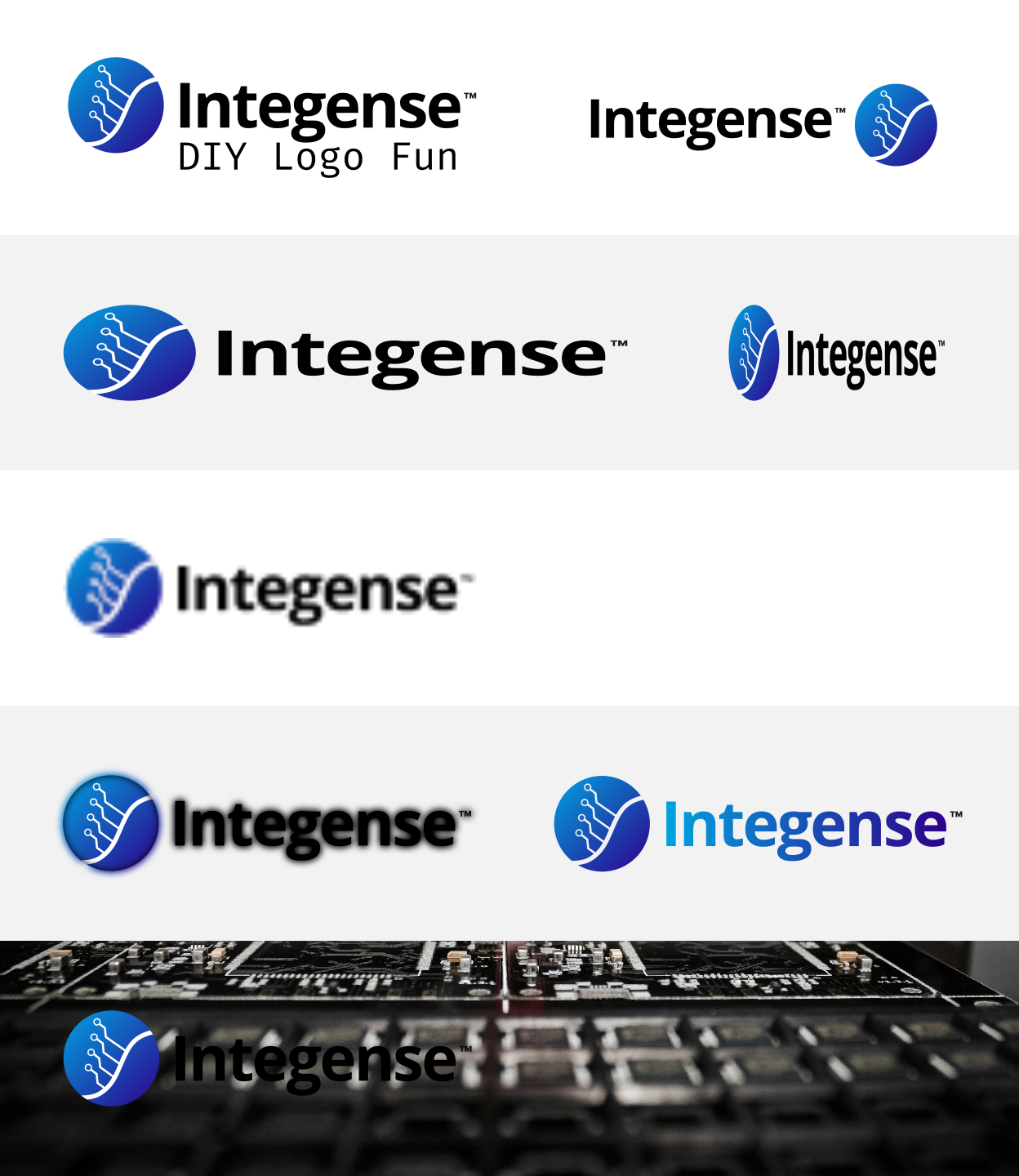
Orientation
The horizontal logo should not be rotated or stacked differently than provided. If a vertical (stacked) version of the logo is ever needed for special formats, use an official version if one exists; otherwise stick to the horizontal format.
Brand Color Palette
Integense Micro’s color palette is carefully selected to represent our brand’s professional and innovative character. Using these colors consistently reinforces brand recognition. Each color is defined for print and digital uses:
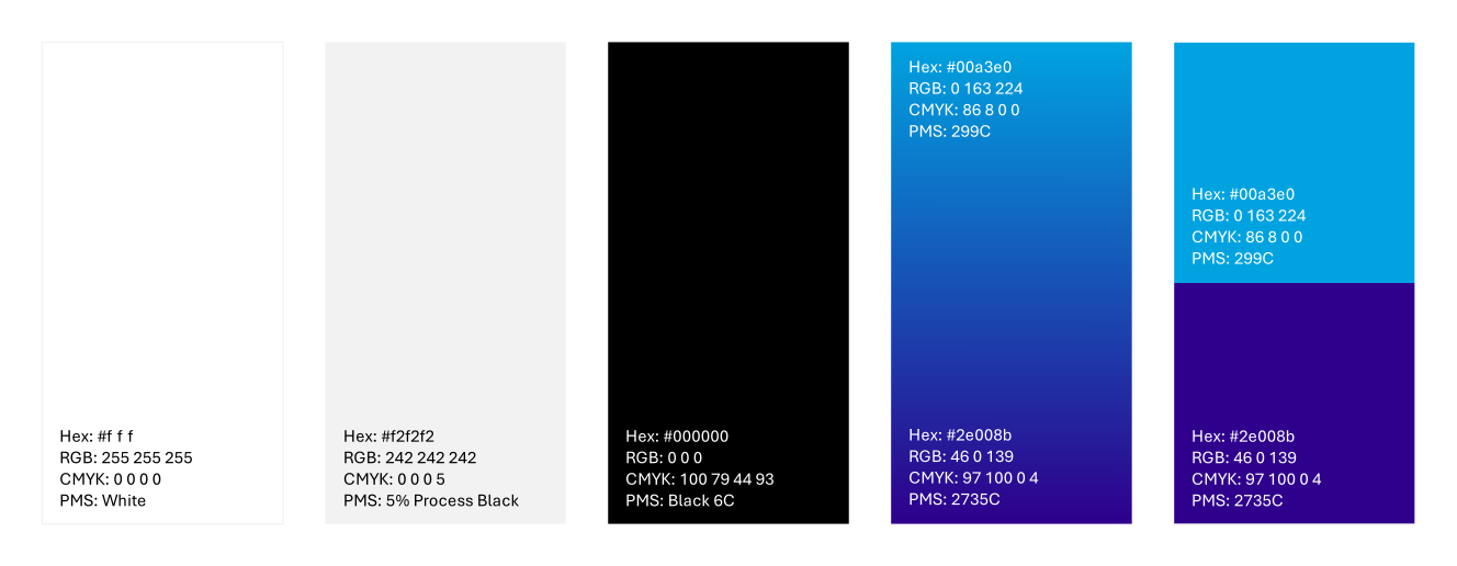
Primary Black
- HEX: #000000
- RGB: 0, 0, 0
- CMYK: 100, 79, 44, 93
- PMS: Black 6 C
Usage: Core text color, accents on light backgrounds, and primary color for monochrome designs. Conveys professionalism and clarity.
White
- HEX: #FFFFFF
- RGB: 255, 255, 255
- CMYK: 0, 0, 0, 0
- PMS: White (no ink)
Usage: Backgrounds and reversed text/logo. Provides cleanliness and simplicity. Use white text or logo on dark backgrounds.
Light Gray
- HEX: #F2F2F2
- RGB: 242, 242, 242
- CMYK: 0, 0, 0, 5
- PMS: 5% Process Black
Usage: Secondary background color or for subtle graphics, dividers, and table cells. Adds a modern, clean look when pure white is too stark.
Integense Blue
- HEX: #00A3E0
- RGB: 0, 163, 224
- CMYK: 86, 8, 0, 0
- PMS: 299 C
Usage: Primary brand accent color. Use for headlines, important highlights, graphs, or icons. This bright blue conveys innovation, technology, and optimism. It should appear in key branding elements like the logo, buttons on the website, and call-to-action graphics.
Integense Purple
- HEX: #2E008B
- RGB: 46, 0, 139
- CMYK: 97, 100, 0, 4
- PMS: 2735 C
Usage: Secondary accent color. Use to complement the primary blue in visuals, such as in charts, backgrounds, or gradient mixes with the blue. This deep purple adds depth and a cutting-edge vibe, reinforcing a high-tech feel when paired with the blue.
Color Usage Guidelines
Always reproduce the colors accurately. For digital materials (web, PPT, video), use the HEX or RGB values. For printed materials, use CMYK process values; for exceptionally critical color matching or branded merchandise, use the Pantone (PMS) references. Maintain sufficient color contrast for accessibility (e.g., use light text on Integense Blue or Purple, and dark text on light gray). The palette can be extended with neutrals (like additional grays) if needed, but avoid introducing unapproved new colors for primary elements.
Typography
Consistent typography strengthens brand recognition and ensures our communications look professional and unified.
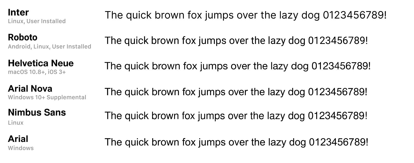
Primary Font – Aptos
Integense Micro’s primary typeface is Aptos, a modern sans-serif font. All headlines, body text, and numbers in official materials should use Aptos whenever possible. This font was chosen for its clean, technical aesthetic and excellent readability, aligning with our innovative yet precise brand personality. Use Aptos in both print and digital formats for consistency (it’s available via Microsoft’s font library).
- Style & Usage: Use Aptos Bold Uppercase for major headings or titles to create a strong impression (e.g., main headings could be set in Aptos Bold, all-caps). Secondary headings can use Aptos Regular (in title case or sentence case as appropriate). Body copy should use Aptos Regular (or Light for a softer look) at a comfortable reading size. For example, in print, recommended hierarchy might be: 32pt Aptos Bold Uppercase for large headings, 20pt Aptos Regular for subheadings, 10pt Aptos Regular for body text, and 8pt Aptos Regular for captions/footnotes. Ensure adequate line spacing for readability (e.g., 1.2x – 1.5x line height for body text).
- Availability: Aptos is a Microsoft sans-serif typeface. If team members do not have it installed, it can be obtained through official sources. Always use the authorized font files to maintain consistency.
Fallback Fonts – Neo-Grotesque Family
In situations where Aptos is not available (e.g., some digital platforms or internal documents where installing the font isn’t possible), use a neutral sans-serif font from the Neo-Grotesque family as a substitute. This ensures visual consistency since these fonts have a similar clean and modern look. Acceptable fallback fonts include Inter, Arial, Helvetica, or similar system-default sans-serifs. These fonts are widely available on most computers and closely match the geometric, legible style of Aptos.
- When using fallback fonts, maintain the same hierarchy and weight usage as specified for Aptos (e.g., use the bold weight for headings, regular for body). Ensure that any substitute font is used consistently across the entire document to avoid mixing typefaces.
- Note: Inter is an open-source font designed for legibility on screens and can serve as a good web fallback. For web content, consider using a web-safe font stack or importing Inter via Google Fonts as an alternative if Aptos web usage is limited.
Typography Guidelines
- Use sentence case for most body text and longer headings for a friendlier, accessible tone. Reserve all-caps styling for short headings or labels (as using uppercase for large blocks of text can be hard to read).
- Avoid mixing too many fonts. Stick to Aptos and its fallback family to preserve a clean, professional appearance. Italics or different weights of Aptos can be used for emphasis or hierarchy instead of introducing a new font.
- Ensure contrast between text and background (e.g., use dark text on light backgrounds and white text on dark blue/purple backgrounds) to maintain readability.
- For external documents, if sending a Word or PowerPoint file that might be opened without our font embedded, consider providing a PDF or ensure the fallback font displays correctly. This prevents the document from appearing off-brand if Aptos isn’t installed on the recipient’s machine.
Imagery and Graphic Styles
Visual imagery and graphics play a crucial role in communicating our brand values of innovation, precision, and reliability. All images and graphic elements should align with Integense Micro’s high-tech and professional aesthetic.
Imagery Theme
Use imagery that reflects the semiconductor industry and our specific expertise. Preferred photographs include high-quality shots of microchips, circuit boards, silicon wafers, laboratory equipment, and related technology in context. Images can also show applications of our products (for example, industrial machinery, medical devices, solar energy systems) to connect our technology to real-world impact. The overall tone of images should be modern, clean, and technical.
Style and Tone
Imagery should appear precise and crisp – well-lit, with sharp focus on details, symbolizing the precision of our work. We often use a cool color tone in images (slight blue or neutral gray casts) to complement the brand palette. Avoid overly warm or saturated filters that clash with our brand colors. If using illustrations or renderings (such as diagrams of an ASIC or architecture), they should be clean, minimalistic, and informative, using brand colors for highlights (e.g., important components in a diagram might be colored Integense Blue).
Graphic Elements
Incorporate technical graphic motifs that reinforce our industry, such as subtle patterns of circuitry, grids, or schematics, but use them in a restrained way (e.g., a faint circuit pattern in a background). Our logo icon or portions of it can be used as a design element (like a watermark or repeated pattern) provided it’s subtle and doesn’t overpower content. Any icons or infographics should use the same line style and color palette – for instance, simple line icons or outline shapes in black or Integense Blue to illustrate points in presentations or on the website.
Consistency
Maintain a consistent look across all images used together. For example, if one marketing brochure uses monochromatic blue-tinted photos, other pages or related brochures should use a similar treatment. This might include using an overlay of the brand blue at a certain transparency over images to give them an Integense “feel.” Consistency in style helps our materials feel like they come from one company.
Avoiding Stock Look
Steer clear of generic or cliché stock photos (like anonymous people shaking hands or unrelated abstract imagery). Instead, choose or create visuals that are directly relevant to our technology and innovation message. Authenticity is key – original photos of our labs, our team at work, or our actual products will always strengthen brand credibility.
Accessibility
Ensure images do not contain critical text (since text in images can’t be read by screen readers). Any important message should be in actual text outside the image. Also, choose images with sufficient contrast and clarity so that if we overlay text (like a tagline on a banner image), the text is easily legible against the background.
By adhering to these imagery and style guidelines, we ensure that all visual content — from website banners to product brochures — consistently conveys Integense Micro’s brand: innovative, technical, and trustworthy.
Messaging Guidelines
A strong messaging framework ensures that Integense Micro’s voice and key messages are consistent across all communications. This framework covers our brand voice traits, the tone we use in different channels, and the core messaging pillars that we emphasize about our products and company. By adhering to this framework, we make sure that whether someone is reading a technical datasheet, a LinkedIn post, or an email from us, the essence of Integense’s message remains the same.
Brand Voice and Tone
Our brand voice is technical yet accessible, authoritative yet engaging. This balance allows us to showcase our expertise in semiconductors while remaining approachable to various audiences. Key characteristics of Integense Micro’s voice and tone include.
Expert & Authoritative
We speak with confidence about semiconductor technology. The tone should establish Integense as an industry expert with years of experience and knowledge. Use accurate technical terms and data to back up statements. However, avoid unnecessary jargon that could alienate readers — we explain complex concepts in clear, understandable language when needed.
Accessible & Clear
Even though our subject matter is advanced, our language should be straightforward. We aim to educate and inform, so we break down complex ideas into digestible messages. This means using clear sentence structures, defining acronyms on first use, and using analogies or examples when helpful. We want both technical professionals and non-specialist stakeholders (like business partners or investors) to grasp our message.
Professional & Formal (to a degree)
The tone is professional and respectful, reflecting the high-stakes, B2B nature of our industry. We use correct grammar, and a generally formal tone, but not overly stiff or dry. It’s acceptable to use a conversational tone when appropriate (especially in marketing content or social media) to keep the audience engaged, as long as we maintain professionalism.
Engaging & Positive
We express enthusiasm for innovation and the solutions we provide. The voice should inspire confidence and excitement about what Integense is doing. For example, instead of just stating facts, we might highlight the impact or benefit: “Our new PureMag® technology shatters the limitations of legacy relays, enabling designs with superior performance.” Action-oriented words (like shatters, enabling) convey excitement. Even though we are authoritative, we avoid sounding monotonous – our communications have a motivating, forward-looking tone.
Consistency
Whether it’s a technical whitepaper, a press release, or a social media post, the voice should feel like it comes from the same entity. Adjust the level of detail and formality based on the medium (e.g., a casual tone and emojis might be okay on a Twitter post celebrating an event, but not in a formal product datasheet), yet the underlying personality — confident, clear, innovative — remains the same.
When writing as Integense Micro, always strive to be clear and precise (reflecting our technical mastery) while remaining relatable and inspiring (reflecting our innovative, problem-solving spirit).
Key Messaging Framework
To ensure consistency in what we communicate, Integense Micro follows a messaging framework that includes our tagline, value proposition, and key communication pillars. These elements guide marketing copy, presentations, and conversations about our brand:
Tagline
“Disrupting the semiconductor supply chain with innovative ASIC solutions.”
This tagline is a concise statement of our brand’s promise and positioning. It emphasizes our disruptive approach and focus on innovation in ASIC (Application-Specific Integrated Circuit) development. We use this phrase (or a close variation) in high-level communications, such as the company website homepage, brochures, or as an email sign-off slogan. It quickly conveys that Integense Micro is not a traditional semiconductor company — we offer something groundbreaking and impactful.
Value Proposition
End-to-end semiconductor innovation that delivers performance, quality, and cost advantages.
Integense Micro’s value proposition can be expressed in a brief statement that we consistently communicate to customers and partners. For example:
Integense Micro provides complete end-to-end semiconductor development – from initial chip design through manufacturing – enabling our customers in industrial, medical, and communications sectors to achieve superior performance, quality, and reliability at lower cost.”
This statement highlights our holistic capabilities (design through production), identifies our target client industries, and underscores the benefits we deliver (high performance, quality, reliability, and cost-effectiveness). It can be adapted as needed, but the core message should remain: we offer a one-stop, innovative solution that gives customers an edge.
Communication Pillars
These are the key themes and messages that support our value proposition. All marketing and communications should reinforce one or more of these pillars:
- Innovation & Cutting-Edge Technology: We highlight how our solutions incorporate the latest advancements and unique technologies. (e.g., discussing our PureMag® relay technology or custom ASIC designs that outperform legacy solutions.) All communications should reinforce that Integense is a forward-thinking innovator bringing new possibilities to the industry.
- End-to-End Expertise & Service: Emphasize our comprehensive capabilities from design to manufacturing to testing. We position Integense as a partner that can handle the entire semiconductor development process. This pillar reassures clients that we have the expertise to manage projects at every stage, simplifying their supply chain (one vendor instead of many) and accelerating time-to-market.
- Quality, Performance & Reliability: Every message should in some way convey our commitment to excellence. Whether it’s data about our chip performance, quality control processes, or long-term reliability of our products, this pillar builds trust. It assures customers that Integense Micro’s solutions are proven, tested, and dependable even in critical applications (medical devices, industrial machinery, etc.).
- Customer-Centric Value: We communicate that our work is driven by customer needs and delivers tangible value. This includes our focus on cost-effectiveness (providing competitive pricing or reducing total cost of ownership through efficient designs) and customization (tailoring ASIC solutions to exact client requirements). Stories or examples of how we solved a client’s challenge or improved their system’s performance are effective ways to highlight this pillar.
These four pillars should appear repeatedly across our content. For instance, a case study might focus on how our innovative design (Pillar 1) gave a customer a reliable solution (Pillar 3) while simplifying their development process (Pillar 2) and saving costs (Pillar 4). By aligning content with these pillars, we ensure a cohesive story about what sets Integense Micro apart.
Content Style and Formatting Guidelines
Beyond what we say (voice and messaging), consistency in how we present written content is also important. The following guidelines ensure our documents, presentations, and online content are formatted in a clear, professional manner that aligns with our brand.
Writing Style
Write in a clear, concise, and active voice. Use short paragraphs and bullet points to break up complex information (just as we do in this guideline document). This makes technical content easier to scan and understand. Prefer active voice (“Our team developed a new chipset” instead of “A new chipset was developed by our team”) to keep the narrative engaging and direct.
Terminology and Capitalization
Use consistent terminology for our products and technologies. For example, always refer to our technology as PureMag® (with the registered symbol on first reference) to protect the trademark and maintain consistency. Use capital letters for official product names and trademarked terms (ASIC is fine as an acronym, but if we brand something like “PureMag Technology,” capitalize it appropriately). Avoid abbreviations or acronyms without explanation on first use (e.g., “Automatic Test Equipment (ATE)” then subsequently just “ATE”). Consistency in naming (e.g., always “Integense Micro” or just “Integense” in text once context is established, but do not switch between the two arbitrarily) will strengthen brand recognition.
Tone Variations by Medium
While our overall voice is consistent, adjust tone and detail to fit the format:
- In technical documentation or whitepapers, it’s acceptable to be more detailed and slightly more formal, as the audience is likely engineers. However, maintain the accessible tone by explaining concepts clearly.
- In marketing copy (brochures, website pages), focus on benefits and use a crisp, upbeat tone. Keep sentences shorter and impactful.
- Internal communications (like team newsletters or training material) can be a bit more casual but should still reflect our core voice (e.g., enthusiastic about innovation, clear and respectful).
Formatting and Layout
Adhere to the brand typography and hierarchy in written materials. For example, in a presentation or document: use the designated heading fonts and sizes as per our typography guidelines (Heading in Aptos Bold, subheadings in Aptos Regular, etc.). This ensures a uniform look. Use our brand colors for text highlights or section headers (for instance, section titles in the Integense Blue). Keep plenty of white space (or light gray space) around text blocks — a clean, uncluttered layout aligns with our precise brand personality.
Bullets and Lists
Use bullet points or numbered lists to enumerate features, benefits, or steps. This not only matches the structured, logical approach our brand takes (especially in technical contexts), but also improves readability. As a guideline, if you find yourself writing a long, complex sentence with multiple clauses, it might be better presented as a list of shorter bullet points.
Visual Consistency in Documents
Ensure any charts, tables, or graphs in content follow our brand style: use the brand color palette for chart bars or lines (e.g., bars in Integense Blue or Purple, with maybe gray for secondary data), and use Aptos for text within graphics if possible. Align table styles with our colors (header rows might have a fill in light gray or blue, etc.). Even things like bullet characters in slides can be customized to a small geometric shape or the brand’s icon shape to subtly brand the content.
Grammar and Punctuation
Follow standard grammar rules and proofread all content. Use a consistent format for things like dates and times (e.g., “March 11, 2025” in U.S. format for external audiences), and units of measurement (use the International System of Units (SI) where applicable, with a space between number and unit, e.g., “5 V”, “10 mm”). Consistent punctuation (like serial commas in lists) and avoiding common errors will make our documents appear professional and trustworthy. If in doubt, refer to a style guide (we can adopt a common one like APA or Chicago Manual for general English usage, as long as we apply it uniformly).
Inclusive and Positive Language
Write in a way that is inclusive and respectful. Avoid slang or idioms that might not translate across cultures (since our partners are global). Focus on positive phrasing (what we do and can do, rather than what we don’t do). For instance, say “Our solution improves efficiency by….” rather than “Previous solutions were unable to….” to keep the message confident and constructive.
Review Process
All outward-facing content (press releases, major marketing materials, website updates) should be reviewed by someone on the marketing or communications team for adherence to these style and voice guidelines. This internal check helps catch any off-brand language or formatting before it reaches the public.
By following these content style and formatting rules, we ensure that every piece of content — whether a single-page datasheet or a 50-page technical manual — feels like it’s coming from the same coherent brand voice and visual style, reinforcing Integense Micro’s credibility and identity.
Digital, Social & Print Branding
Website Branding and Digital Presence
Our website and other digital platforms are often the first point of contact with our audience, so maintaining brand consistency online is critical:
Website Design
The website should prominently feature our logo (usually at the top-left of the header on each page) and use our brand color palette throughout. The overall look should be clean and technical. Use Integense Blue for primary actions (like links, buttons or hover states) and Integense Purple for secondary accents or icons, ensuring the site immediately feels on-brand. Backgrounds should predominantly be white or light gray for clarity, with occasional uses of our colors in banners or section backgrounds to add interest.
Web Typography
Where possible, use the Aptos font on the website (for headings or hero banners) by embedding it or using a web font. If that’s not feasible due to licensing or performance, use the fallback fonts (such as Inter or a system sans-serif stack) for body text and secondary content. Ensure font sizes and styles on the site mirror our guidelines (e.g., big, bold headlines, clear body text). For instance, the homepage tagline or main heading could be in a large Aptos Bold, while body content is a web-safe sans-serif at a legible size. Consistency in font usage across the site’s pages is key.
Layout and UI Elements
Utilize the brand’s design motifs in the site’s UI. For example, buttons might be filled with Integense Blue (with white text) and use slightly rounded corners to reflect a modern tech feel. Icons used on the site (for features or services) should be in line with our graphic style – simple, line-based or flat icons possibly tinted in our brand colors. Images on the site (such as header images or product photos) should follow the imagery guidelines, giving a cohesive visual experience.
Navigation and Tone
The language on the website should follow our brand voice: menu labels and call-to-action texts should be clear and concise (e.g., “Solutions”, “About Us”, “Contact”, rather than longer or clever but confusing phrases). Content like blog posts or news should also adhere to tone guidelines (informative and engaging). Even microcopy (small bits of text like form instructions or button labels) contribute to the brand feel – keep them professional and helpful.
Responsive and Accessibility
Brand consistency extends to the mobile experience. Our digital brand elements (logo, colors, type) should remain consistent and recognizable on smaller screens. Make sure the logo scales well and colors remain the same values on all devices. Additionally, ensure the site meets accessibility standards (e.g., color contrast ratios for text, alt text on images, etc.), reflecting our value of reliability and quality – a well-built, accessible site shows we care about all users and details.
Other Digital Platforms
For any other digital presence (like a client portal UI, or an app if we have one), apply the same principles: use the official logo, the color palette, and typography choices to skin the interface. The goal is that no matter where someone encounters Integense digitally, it feels like a unified experience.
Social Media Visual Consistency
Social media extends our brand to various audiences and must visually and tonally align with our identity.
Profile and Cover Images
Use the company logo as the profile picture on platforms like LinkedIn, Twitter, etc. Typically, the icon portion of the logo (or a simplified version) is ideal for the small profile image circle/square. Ensure it’s optimized for that use (clear even at small sizes). For cover/banner images on profiles, use branded imagery: for example, a banner with a clean tech-related photograph overlaid with a subtle blue filter and possibly our tagline in Aptos font. Keep the cover images updated if branding evolves and ensure they don’t get cropped awkwardly on different screen sizes.
Color and Typography in Posts
Wherever possible, incorporate our color palette into social media graphics. For instance, if sharing an announcement and creating a graphic for it, use Integense Blue or Purple for backgrounds or text highlights. Use our typography guidelines for any text in images (if custom designing posts). On platforms like LinkedIn that allow formatting, ensure any embedded media or PDFs follow our fonts and colors as well. While standard text posts can’t force a font, the language should still reflect our voice (professional, clear, engaging as described in voice/tone).
Content Style
Maintain the brand voice in captions and post copy. Even though social media is more casual, we should still keep a level of professionalism. It’s fine to be a bit more conversational or use a lighter tone on social (for example, celebrating a team event or a holiday greeting), but always in line with our values (e.g., highlight innovation or teamwork, avoid slang that could be off-brand).
Visual Templates
It can help to have pre-designed templates for common post types – for example, a template for product announcement (with a consistent layout using our colors and fonts), a template for quotes or testimonials, etc. This ensures that when different team members create social content, they all look consistent. Use our brand elements such as the logo (small in a corner or at the bottom), brand-colored borders or shapes, etc., in these templates. Over time, followers should come to recognize an Integense post at a glance from these visual cues.
Consistency Across Platforms
Ensure that from Twitter to LinkedIn to any industry forums we engage in, the branding remains consistent. Use the same logo/avatar, similar voice, and where applicable, similar design elements. This way, if someone follows us on multiple platforms, they receive a cohesive brand experience.
Frequency and Engagement
While not purely a brand guideline, maintaining a regular posting schedule and responsive engagement also reflects on our brand’s reliability and active presence. An inactive social account with outdated branding can hurt perception. So, any time we update our logo or branding, social media profiles should be immediately updated to match.)
Marketing Materials (Brochures, Presentations, Ads)
All marketing collateral should adhere to Integense Micro’s visual and messaging standards. This ensures that whether someone sees a printed brochure or a conference slide, it consistently feels like our brand.
Brochures & Data Sheets
Use the official Integense Micro template for brochures. Typically, this includes the logo placed on the cover (often top right or bottom left), and a cover image that aligns with our imagery style (perhaps a technology background in our brand colors). Inside pages should use our typography hierarchy for headlines and body text (Aptos font usage, as detailed in Typography guidelines). Maintain the color scheme: section headers or call-out text in blue or purple; body text in black/gray. Include the tagline or a short company description on brochures to reinforce messaging. Ensure any charts/diagrams use brand colors. The layout should be clean with plenty of white space or light gray. Avoid cluttering with too many fonts or colors. A small footer with our logo or website in brochures can reinforce brand on each page.
Presentations (e.g., PowerPoint templates)
All company presentations should use the official slide template. This typically includes a title slide featuring our logo on a branded background (for instance, a white logo on an Integense Blue background, or an image with a blue overlay) and subsequent content slides with a consistent header/footer. Use our fonts (Aptos or the approved fallback) in the slides. Headings might be in our blue color to distinguish them. Bullet points and text should align with our content style (no overly long paragraphs on slides; use concise bullet points as per our voice guidelines). Include visual elements like graphs or icons that match the brand style. The last slide often has our logo and tagline and contact info on a branded background – ensure those elements follow the color and font rules.
Advertisements
Whether digital ads (banners, social ads) or print ads, the design needs to be unmistakably Integense. Use the logo and/or brand icon in the ad prominently (unless it’s a tiny ad where perhaps just the icon and name suffice). Use our primary colors as the dominant palette – for example, a digital banner might have a white background with Integense Blue text and the logo, or a solid blue background with white logo and a striking headline. The messaging in ads should be extremely tight but still on-voice: e.g., a tagline or a key benefit. For print ads in magazines, use high-resolution images aligned with our style, and include a clear call-to-action (like our website URL) in brand font. Always observe print specifications with our CMYK colors or Pantone to get the color accuracy. Review all ads for contrast and readability (our blue on white is great; white text on blue is also high-contrast; avoid using purple text on blue background or similar low-contrast combos).
Trade Show & Event Materials
This includes banners, booths, posters, and merchandise. All should follow brand visuals. Banners/posters should use our logo at the top and brand colors as base. Key messages on these materials should align with our pillars (e.g., a banner might highlight “Custom ASIC Solutions – from concept to production” with our branding). Any freebies or merch like USB drives, t-shirts, etc., should use the correct logo versions (one-color logo in white or black if needed on colored material) and match pantone colors. Ensure quality printing so that our purple and blue come out correctly on physical materials.
Co-branding
Occasionally, we might create materials with partners or clients (like a joint case study or event sponsorship). In such cases, make sure the Integense branding is still clearly represented. Use our logo with proper clear space alongside partner logos. The overall design should still lean on our brand colors or a neutral look that doesn’t conflict with our identity. Clear rules should be agreed upon (often, co-branded materials will have a neutral background, with each brand’s logo and colors in separate sections). Always protect the integrity of our logo (size and placement should be equal to the partner’s, and never modified).
In all marketing materials, the key is consistency. A person looking at any piece of material should immediately identify it as Integense Micro, even before seeing the logo, because the colors, fonts, and tone are recognizable.
Email and Communication Branding Standards
Everyday communications also reflect on our brand. This includes employee email signatures, email newsletters, and other written communications.
Email Signatures
All employees should use a standardized email signature format that includes key brand elements. For example:
Name | Title
Integense Micro – Fabless ASIC Solutions (or optionally include tagline here)
Phone | Email | Website (and possibly address)
(Optional small logo image)
The text should be in our chosen email font (if we can use Aptos via Outlook or Gmail that’s great; if not, a standard font like Arial is acceptable). Use our brand colors in modest ways – for instance, the name or company name could be in Integense Blue. Avoid wallpapers or background colors in email – keep it clean. No personal quotes or unapproved graphics, as those can appear unprofessional and off-brand. Consistency across all team members’ signatures reinforces our brand’s unity and attention to detail.
Email Templates
For mass emails or newsletters (e.g., product announcements, press releases sent via email, or monthly newsletters), use branded email templates. These should have our logo at the top, possibly in an email-friendly size, and use a header color band in our brand color. The typography in emails is limited by HTML, but stick to web-safe fonts that are similar to our brand font (Verdana, Arial, or Helvetica are fine for email readability). Keep the color scheme to our palette — for instance, headings or important text in the email can be Integense Blue. Include the tagline or a closing message that ties back to our brand voice. Ensure all emails include our contact information and an unsubscribe link (for mass emails) in a professional manner, usually in a footer that might have a lighter version of our logo or company name.
Document Templates
For formal communications like letters, memos, proposals, or reports, have a Microsoft Word template with our branding. This typically includes a cover page with the logo and perhaps a banner of our brand colors, and then a letterhead on subsequent pages (a header or footer with the company logo and info). Use the Aptos font in these documents for consistency, or the defined fallback if sharing externally in Word format. Page numbering, heading styles, etc., should all be pre-formatted in line with our brand (e.g., Heading 1 style = Aptos Bold 16pt in blue, Heading 2 = Aptos Regular 14pt, Body = 11pt black, etc.). By using these templates, everyone in the company can create branded documents easily without having to recreate styles each time.
Internal Communications
Even things like internal newsletters, Slack/Teams channels, or announcements can subtly follow brand guidelines. For instance, when presenting internally, using the branded PowerPoint template is encouraged. While internal memos can be a bit less formal, using our branding even internally helps train everyone to be familiar with it and take it seriously. It also prevents any off-brand habits from forming (like using random colors or clip-art in presentations).
External Communications
Any official communication (press releases, customer emails) must go out on branded letterhead or email templates. Press releases should have our logo and standard boilerplate text about the company (aligned with the messaging framework) at the bottom. Ensure that the tone of these communications is polished and on-brand as discussed. If using PR distribution services or posting news on our website, double-check that formatting carries over (sometimes copying into a web form can strip formatting—ensure at least the basics like text is in the right case, etc.).
Business Cards and Stationery
In addition to digital communications, printed stationery must follow brand standards. Business cards should have our logo, the individual’s name and info in our fonts, and use our colors (often business cards are a simple white design with the logo and text in black or blue, or a two-sided design with one side solid blue with logo reversed out in white). Letterhead paper can have a subtle design with our logo and perhaps a color accent. Even the envelopes could include our logo. All of this ensures that whether communication is via email or paper, it consistently represents Integense Micro.
By standardizing these aspects of daily communication, we present a unified, professional brand image to clients, partners, and even amongst ourselves.
Implementation & Maintenance
Internal Usage Policies & Team Training
Having great brand guidelines is only effective if everyone follows them. Integense Micro has policies and training in place to ensure compliance and understanding of our brand standards
Access to Assets
All employees (and contractors, as needed) should have easy access to official brand assets and templates. This includes a shared drive or brand portal containing our logos in various formats (PNG, SVG for digital; EPS for print), templates for documents/presentations, and a copy of this brand guidelines document. By providing the tools, we make it simple for team members to do the right thing.
Usage Policies
We have a clear internal policy that any public-facing material must adhere to the brand guidelines. Before new marketing materials, web pages, or significant documents are published or released, they should be reviewed for brand compliance. Certain uses of the brand may require approval – for example, any new variant of the logo or a special graphic using the logo must be cleared by the marketing department. The policy also covers proper use of brand assets: e.g., do not give our logo to external parties without context or allow external use that isn’t approved (like a partner putting our logo on their site should be reviewed). Essentially, treat the brand elements as valuable company property – they shouldn’t be modified or used carelessly.
Employee Training
New hires, especially those in marketing, sales, product management, or any customer-facing roles, should receive an orientation on the brand guidelines. This might include a short training session and a handbook (or this document) to study. Training should cover why brand consistency matters, examples of proper and improper usage, and the process for getting help (e.g., who to ask if unsure about branding on something). Periodic refresher trainings or tips can be shared (for instance, if we update a guideline, send a company-wide email highlighting the change). For teams that create a lot of content (like marketing or engineering teams writing whitepapers), consider deeper workshops on tone and visual guidelines.
Enforcement and Support
Create a culture where colleagues feel responsible for the brand. If someone spots an off-brand use (like an outdated logo or a document using wrong colors), they should feel empowered to mention it and help correct it. At the same time, have designated brand champions or a brand manager who can answer questions and provide feedback. The goal is not to police harshly but to encourage pride in a consistent brand image. Friendly reminders and easy-to-follow guides (like checklists for creating a PowerPoint or a quick-reference of color codes) can assist in compliance.
External Partners
These guidelines should also be communicated to any external agencies, designers, or partners who produce materials for us. If we hire a design firm for a new website or a PR agency for communications, share the brand guide with them and insist they follow it. Sometimes an NDA might be required for sharing internal docs, but brand guidelines are often okay to share externally because they ensure our brand is represented correctly outside the company as well.
Continuous Feedback
Encourage team members to provide feedback on the guidelines – for instance, if a salesperson finds that a certain template doesn’t cover one of their needs, they should inform marketing so the template can be improved. By iterating and listening to internal users, the brand materials stay practical and useful, not just theoretical ideals.
Updating and Evolving Brand Guidelines
Brands are not static; they evolve over time along with the company’s strategy, market, and design trends. Integense Micro’s brand guideline document is a living document that should be maintained and updated as needed.
Remember, the purpose of evolving the brand guidelines is to keep Integense Micro’s brand relevant, strong, and cohesive. As we innovate in technology, we should also ensure our branding remains modern and reflective of who we are. By diligently maintaining this document and the practices around it, we protect and strengthen our brand’s presence in the semiconductor industry for the long term.
Version Control
Keep track of revisions to the guidelines. (As seen at the end of our Brand Manual, we have a change log: e.g., an initial release on 2025-01-15, updated font on 2025-03-11, etc.) Each update to the guide should be logged with a date and a brief description of the changes. This helps everyone know what’s new and ensures they are referring to the latest standards. When major changes occur (like a logo redesign, new color added, or font change), clearly mark the new version (e.g., Version 2.0) and distribute it.
Brand Evolution
As the company grows or pivots, the brand’s identity might need to adjust. For example, if Integense Micro were to expand into new markets or introduce consumer-facing products, we might update our messaging or add to our personality traits. Periodically (perhaps annually or bi-annually), leadership and marketing should review if the mission, vision, and values are still accurately reflected, or if any new core value emerged that we want to articulate. The guidelines should be updated to reflect any such shifts so that communications stay aligned with the current company direction.
Design Refreshes
Design trends change, and while consistency is key, there may come a time for a brand refresh. If we update the logo design, choose a new primary font, or significantly change our color palette, those are major updates to the brand identity that must be captured in a new edition of the guidelines. When doing so, plan a transition period (for instance, when we updated our brand font to Aptos in March 2025, we communicated the change and gave teams a timeline to switch over). The brand guide should provide guidance for phasing out old assets and implementing new ones.
New Sections or Guidelines
As new needs arise; we may add sections to this document. For example, if in the future we engage heavily in video content, we might add guidelines for video (such as intro/outro logo animation, lower-third graphics style, and so on). Or guidelines for social media might expand with new platforms. Remain proactive about writing down standards for any new form of communication that becomes relevant.
Feedback Loop
Solicit feedback from internal teams about the usefulness of the brand guide. Are there recurring questions not answered here? That’s a sign that the guide might need additional information or clarity. Perhaps the engineering team is unsure how technical diagrams should look – we could then add a subsection under visual guidelines for “Engineering Diagrams” if needed. Keeping the guide practical and user-friendly is important; otherwise, people might ignore it.
Governance
Assign someone (or a small committee) the responsibility for brand governance. This person (e.g., a Brand Manager or Marketing Director) will be the point of contact for any brand-related approvals and will oversee updates to the guideline. They ensure that when changes are made, those changes are disseminated (through meetings, emails, internal wiki updates, etc.). They also might schedule periodic brand audits – reviewing a sampling of recent documents or posts to check if guidelines are being followed, and if not, determining whether to adjust the guidelines or reinforce training.